What is b (Bright) Tone - from PCCS
Published Updated

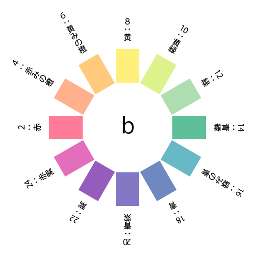 *The colors in the figure are for illustrative purposes only.
Bright Tones are a category of light and clear colors within the PCCS (Japan Color Research Institute Color System), referring to bright hues. They have a higher lightness value than Vivid Tones and are generally described as possessing bright, healthy, cheerful, and vibrant characteristics. Other applicable descriptions include lively, cheerful, distinct, clear, and bright.

- Saturation: Bright Tones are a group of colors with relatively high saturation. They possess vivid and pure hues. High-saturation colors are eye-catching and well-suited for expressing vitality and energy.
- Lightness: Bright tones are a group of colors with relatively high lightness. They possess a striking quality, like bright light, giving a positive impression and creating an open atmosphere.
- Psychological Effects: Bright tones are also a key element in terms of psychological effects. Bright, vivid colors have the effect of imparting energy and vitality, evoking positive emotions. Furthermore, their cheerful and glamorous impression makes them well-suited for expressing joy and fun.
Bright tones are a color group utilized across various fields, including fashion, interior design, products, and accessories. The vivid and bright impression created by their high saturation and lightness makes them the ideal color group for creating a positive atmosphere that appeals to many people seeking a unique style. By understanding the principles of color theory and skillfully utilizing bright tones, you can create captivating designs.
Using Bright Tones in Fashion
Bright tones possess bright, healthy, and cheerful characteristics, conveying a sense of vibrancy. By incorporating these traits into fashion items, you can enjoy a style that is energetic and full of vitality.


Bright tones are colors that convey a cheerful and healthy impression, and incorporating them into your fashion allows you to enjoy a look that naturally brings a smile to your face. Embrace your individuality, incorporate bright colors, and enjoy fashion. We hope that learning about color will help you discover a style that is uniquely yours.
- Color Coordination Balance: Because bright tones are so vivid, it’s important to consider balance when coordinating colors. For example, when pairing a bright-toned top with bottoms, coordinating other items in neutral or pastel colors helps create overall harmony.
- Seasonal Pairing: Bright tones are a color group that pairs particularly well with the spring and summer seasons. By incorporating bright-toned fashion items alongside the bright sunshine, you can create a look that exudes a strength and freshness that rivals the sun’s rays. During the spring and summer seasons, try incorporating bright-toned dresses, shirts, and bags to enjoy a bright and vibrant style.
- Incorporating Bright Tones Through Accessories and Small Items: If you’re new to wearing bright tones, we recommend starting with accessories and small items. For example, a bright yellow bag, a pink scarf, or green earrings can add a pop of color to a simple outfit. Another example: pairing a white or gray dress with bright-toned sandals or a handbag instantly makes your look more vibrant.
- Styling That Showcases Your Personality: Bright tones are perfect for creating looks that highlight your individuality. By incorporating your favorite colors, you can enjoy self-expression through fashion. Wear bright colors with confidence and create a unique style that stands out from the crowd.
Bright tones are colors that convey a cheerful and healthy impression, and incorporating them into your fashion allows you to enjoy a look that naturally brings a smile to your face. Embrace your individuality, incorporate bright colors, and enjoy fashion. We hope that learning about color will help you discover a style that is uniquely yours.
Using Bright Tones in Interior Design
Incorporating bright tones into your interior design creates a bright, open space and helps you achieve a comfortable living environment.


Incorporating bright tones into your interior design allows you to create a bright, healthy, and cheerful space. Whether used as accent colors, to express seasonal themes, or combined with plants, you can enjoy a variety of styles. Make the most of the charm of bright tones to create a comfortable living space.
- Compatibility with Natural Light: Bright tones look particularly attractive under natural light. Placing bright-toned items near windows or in well-lit areas maximizes the room’s brightness and creates an open, airy atmosphere.
- Incorporating a Sense of Seasonality: Bright tones pair particularly well with the spring and summer seasons. By incorporating bright pinks and greens in spring and summer, and orange and yellow hues that evoke a hint of autumn during the lingering heat of late summer, you can create a sense of the season.
- Creating a Comfortable Space: Because bright tones convey a bright and healthy image, they are also ideal for creating a relaxed atmosphere. Bright hues lighten the mood and help create a cozy space. Adjust the proportion of bright tones from secondary to accent colors to create a color scheme tailored to your specific purpose.
- Compatibility with Plants: Bright-toned interiors pair well with green houseplants and vibrant flowers. The combination of plants and bright tones creates an even more positive atmosphere.
Incorporating bright tones into your interior design allows you to create a bright, healthy, and cheerful space. Whether used as accent colors, to express seasonal themes, or combined with plants, you can enjoy a variety of styles. Make the most of the charm of bright tones to create a comfortable living space.