[Color scheme image summary] Let's learn to use basic colors!
Published Updated
![[Color scheme image summary] Let's learn to use basic colors!](/images/color-basic/summary.png)
Color schemes include casual, natural, modern, and others. While these terms are often confused with fashion and style terminology, leading to some ambiguity, each color scheme follows specific rules regarding the colors used.
It’s not that you absolutely must follow these rules to achieve a certain look, but knowing them will help you enjoy color even more.
Let’s master the basics of color usage so you can choose colors that suit the occasion!
List of Color Schemes
Casual

The casual color scheme centers on warm tones, particularly orange, which evokes the feeling of sunlight, and is composed of high-brightness, high-saturation colors.
Active
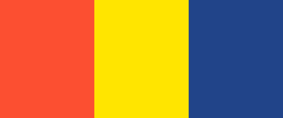
The Active color scheme features high-saturation warm tones as the main colors, combined with contrasting hues or black of the same high saturation.
Natural
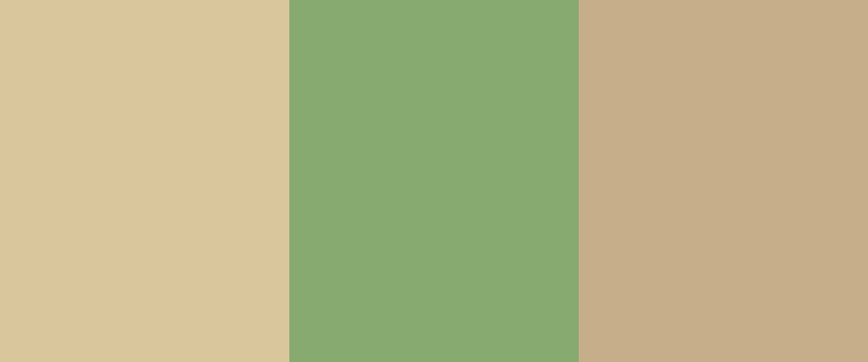
The Natural color scheme uses warm and intermediate tones—such as red, orange, yellow, yellow-green, and green—and centers on low- to medium-saturation colors of medium brightness, incorporating muted tones similar to a tonal palette.
Romantic

Romantic evokes images of "cute," "delicate," and "lovely." It is expressed by combining high-brightness warm colors with medium to low saturation.
Elegant

Just as many people associate the word "elegant" with a wisteria-like shade of purple, using a medium-toned purple as the main color and pairing it with relatively bright, soft colors of low to medium saturation creates an elegant look.
Classic
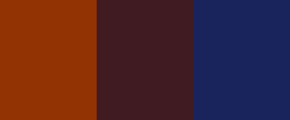
Classic creates a sophisticated, warm image by using dark tones or dark grayish tones of warm colors (i.e., brown) as the base color and coordinating colors from the same color family.
Chic

Chic color schemes often feature medium- to low-luminance achromatic colors or gray tones as the main colors. Even with accent colors, contrast is kept subtle, creating a gentle, smooth palette where the difference in hues is just perceptible.
Modern

Modern styles create a sense of definition using high-contrast color schemes with achromatic colors. Cool tones are frequently used as base colors, and colors with significant differences in lightness and saturation are used for accent and assortment colors.
Clear

Clear creates a refreshing image by combining high-brightness cool-toned colors with medium to low saturation.