Use these colors for natural color schemes (colors)!
Published Updated

Overview of the Natural Image
"Natural" is a color scheme that uses colors commonly found in nature. As the name suggests, it is characterized by a natural appearance, a rustic feel, and an unpretentious atmosphere.
This is an effective theme for when you want to feel the blessings of spring or autumn and refresh your mood. The color palette uses warm and intermediate tones—such as red, orange, yellow, yellow-green, and green—with a focus on low- to medium-saturation colors of medium brightness, incorporating muted tones similar to a tonal color scheme.
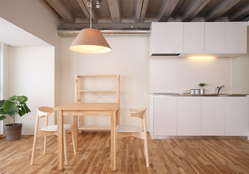
This color scheme is natural and blends well when creating a home filled with the warm smiles of family, an elegant yet relaxed atmosphere, natural and soft color combinations, and a free-spirited, liberating feel that highlights the individual strength of each person.
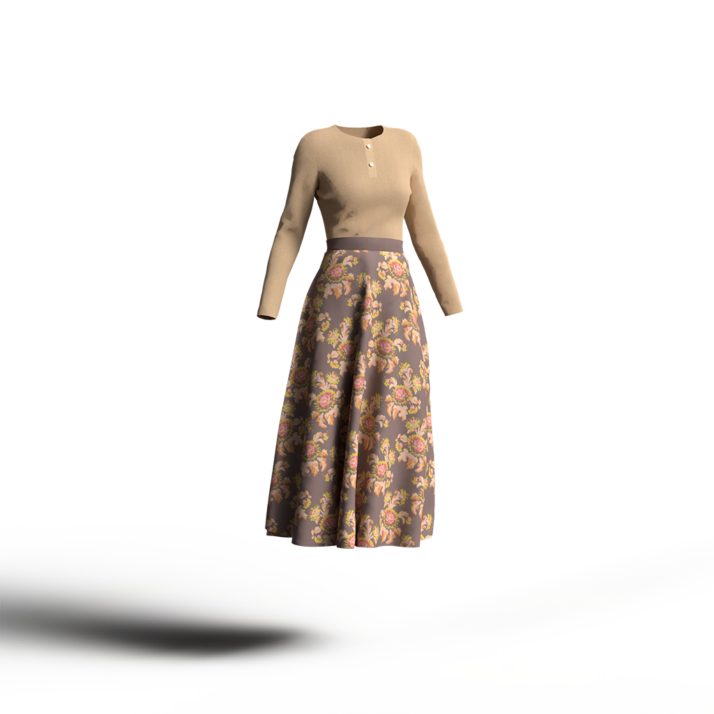
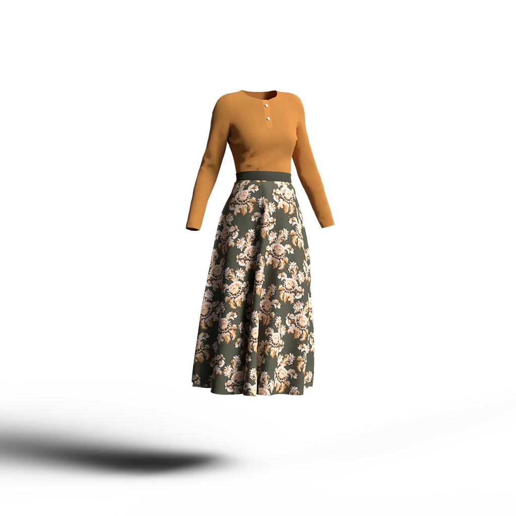
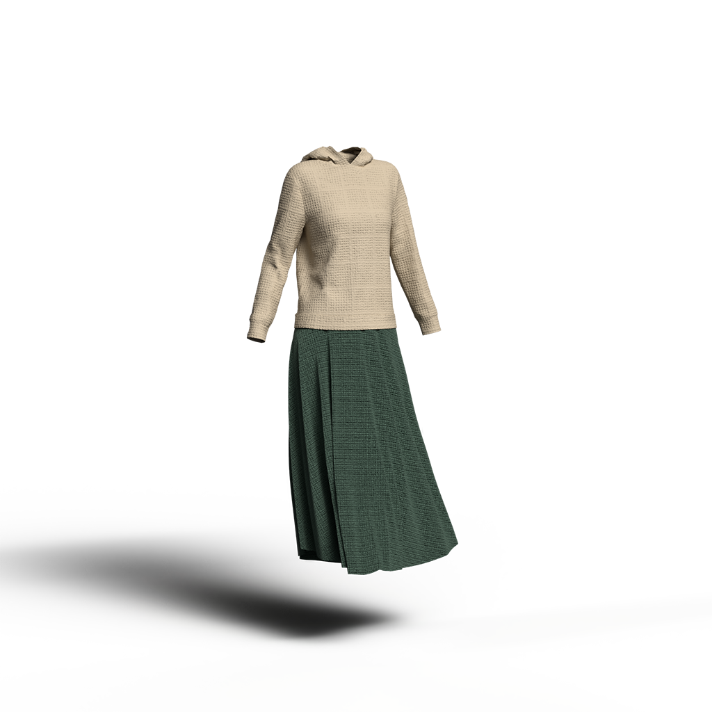
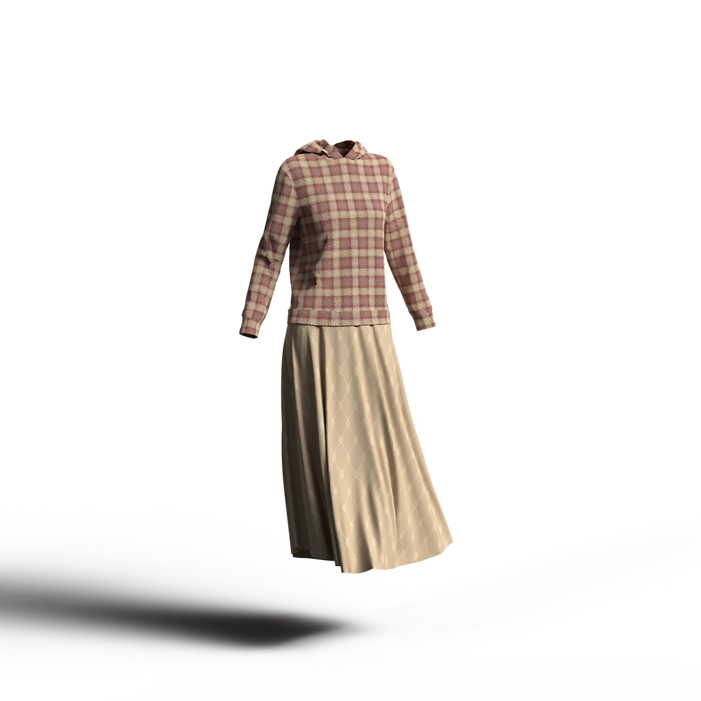
In fashion, this translates to a natural, effortless style. Silhouettes are comfortable and not constricting, with a moderate amount of ease. Representative colors include beige and khaki. Natural materials such as cotton, linen, wool, and suede are preferred. Patterns include those found in handcrafted items, such as stripes and batik designs.
"Natural Harmony" is a color scheme technique based directly on the color combinations found in nature, proposed by the American natural scientist Rud. The surface of a leaf is illuminated by sunlight and appears bright yellow, while the underside is in shadow and appears darker, with a bluish tint compared to the surface. This same color combination—where colors closer to yellow are brighter and colors closer to blue are darker—is called Natural Harmony. It is one technique used to create a sense of stability when struggling with color choices.
This is an effective theme for when you want to feel the blessings of spring or autumn and refresh your mood. The color palette uses warm and intermediate tones—such as red, orange, yellow, yellow-green, and green—with a focus on low- to medium-saturation colors of medium brightness, incorporating muted tones similar to a tonal color scheme.
In fashion, this translates to a natural, effortless style. Silhouettes are comfortable and not constricting, with a moderate amount of ease. Representative colors include beige and khaki. Natural materials such as cotton, linen, wool, and suede are preferred. Patterns include those found in handcrafted items, such as stripes and batik designs.
"Natural Harmony" is a color scheme technique based directly on the color combinations found in nature, proposed by the American natural scientist Rud. The surface of a leaf is illuminated by sunlight and appears bright yellow, while the underside is in shadow and appears darker, with a bluish tint compared to the surface. This same color combination—where colors closer to yellow are brighter and colors closer to blue are darker—is called Natural Harmony. It is one technique used to create a sense of stability when struggling with color choices.
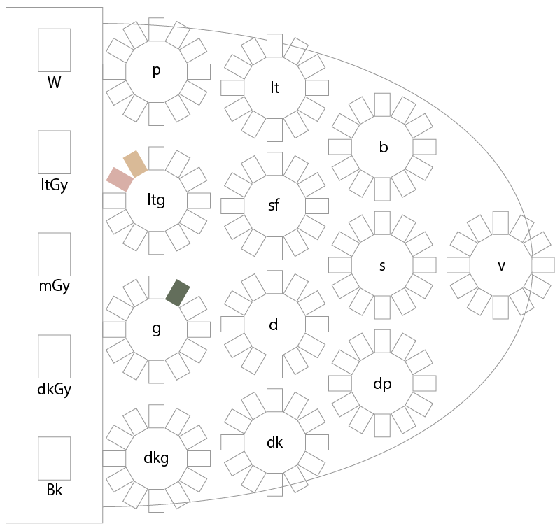
Natural Color Scheme Example 1
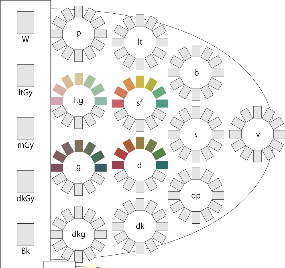
<Color Swatch Samples>

<PCCS Tone Chart (Similar Colors)>
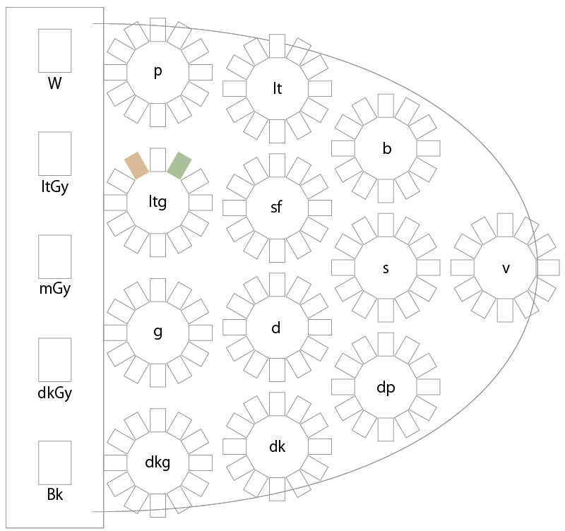
Natural Color Scheme Example 2
<Color Swatch Sample>
<PCCS Tone Chart (Similar Colors)>
When you pick out colors used in various outfits and explore lovely combinations and color scheme patterns, choosing colors becomes fun—whether for design or personal styling.
On this site, under the "Enjoying Color" category, we introduce color coordination for clothing and home decor in a blog format.
>> "Enjoying Color" Top Page
Take the Quiz!
We’ve turned the content featured on this page into a quiz. There are 3 questions in total. Select your answers to see the results. <Question>
Great job!
Replay?
Next
×
A natural-looking color coordination
Color Coordination Techniques and Creating the Right Image
Understanding color harmony makes it easier to incorporate natural color schemes into your designs and outfits. Please also check the differences between representative colors and those with a natural look.
<Color Coordination Techniques>
Tone-on-tone color scheme, Tone-in-tone color scheme, Tonal color scheme, Camay color scheme, Focamay color scheme