Color Pattern (#FAFAF9, #E8DBDC, #D9BBBF, #6D162C)
Pattern Examples
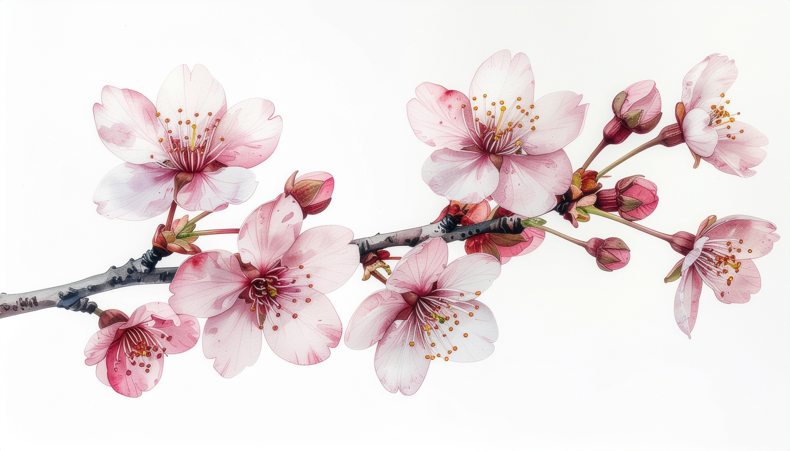
An off-white background (#FAFAF9) covers roughly 76% of the composition, while a pale pink (#E8DBDC) and a slightly deeper dusty pink (#D9BBBF) act as accents that recall the soft gradation of cherry blossom petals. The hues stay within the red to red-purple family, and all tones are kept high in lightness and low in saturation, producing a unified and airy harmony.
Contrast is intentionally subtle, which lets the palette breathe with a watercolor-like transparency and gentleness. It is well suited to Japanese confectionery packaging, spring wedding invitations, baby products, and feminine cosmetic branding—anywhere softness and elegance need to be communicated. Because the contrast is low, the palette performs best in image-led printed pieces and packaging rather than text-heavy interfaces.