Color Pattern (#FF933E, #439022, #401B07, #E6F1F0, #964157)
Pattern Examples
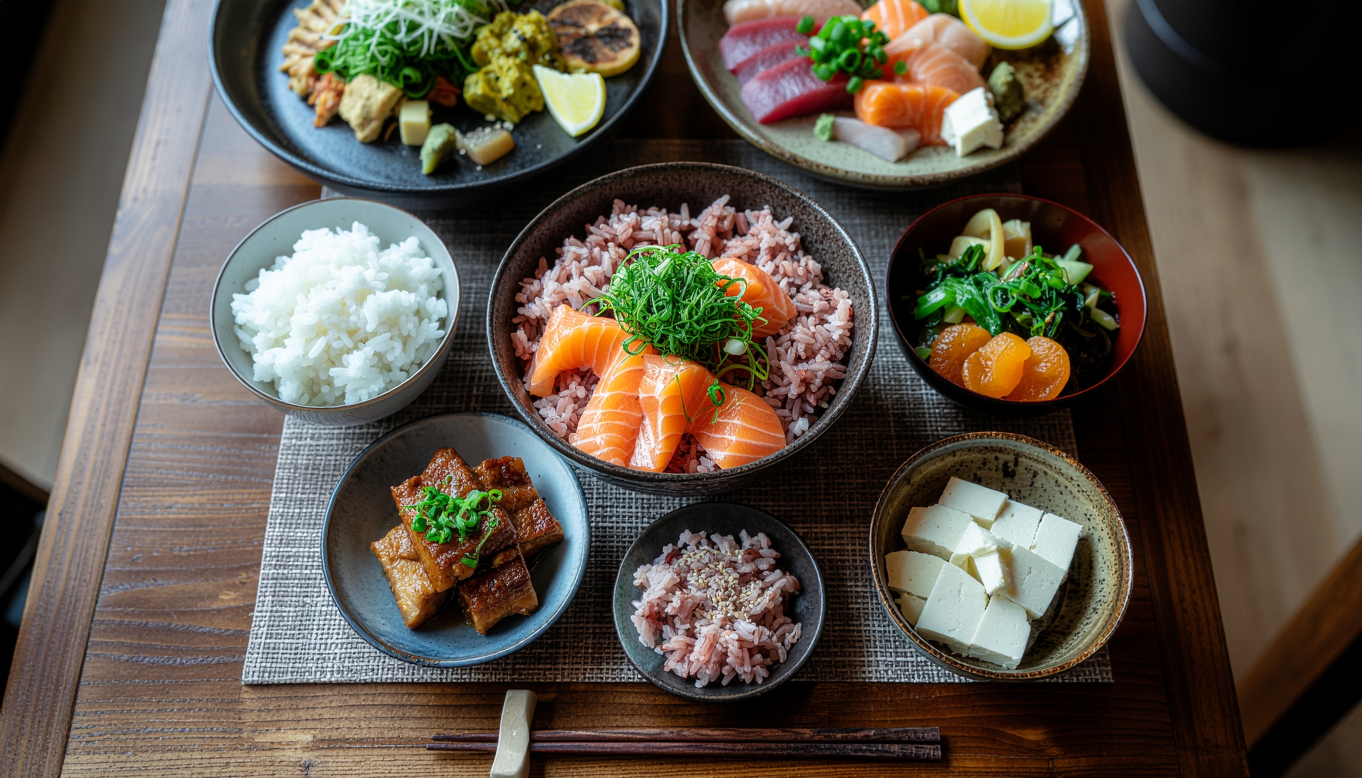
#FF933E orange and #439022 green sit in near-complementary tension, producing the appetizing contrast typical of food photography. The lacquer-dark #401B07 grounds the composition while the cool off-white #E6F1F0 opens breathing room and lends a clean, paper-like quality. The #964157 accent — reminiscent of safflower dye or pickled plum — raises the warm-side saturation just enough to give the palette a distinctly Japanese composure without tipping into sweetness. With four warm hues balanced by one cool neutral, the scheme has strong value contrast and reads clearly at small sizes. It suits restaurant menus, recipe-site headers, natural-food packaging and any design that needs to feel both warm and refined.