Heartfelt Pink: The 2026 Color of the Year Decoded Through PCCS and Judd's Four Principles of Color Harmony
Published
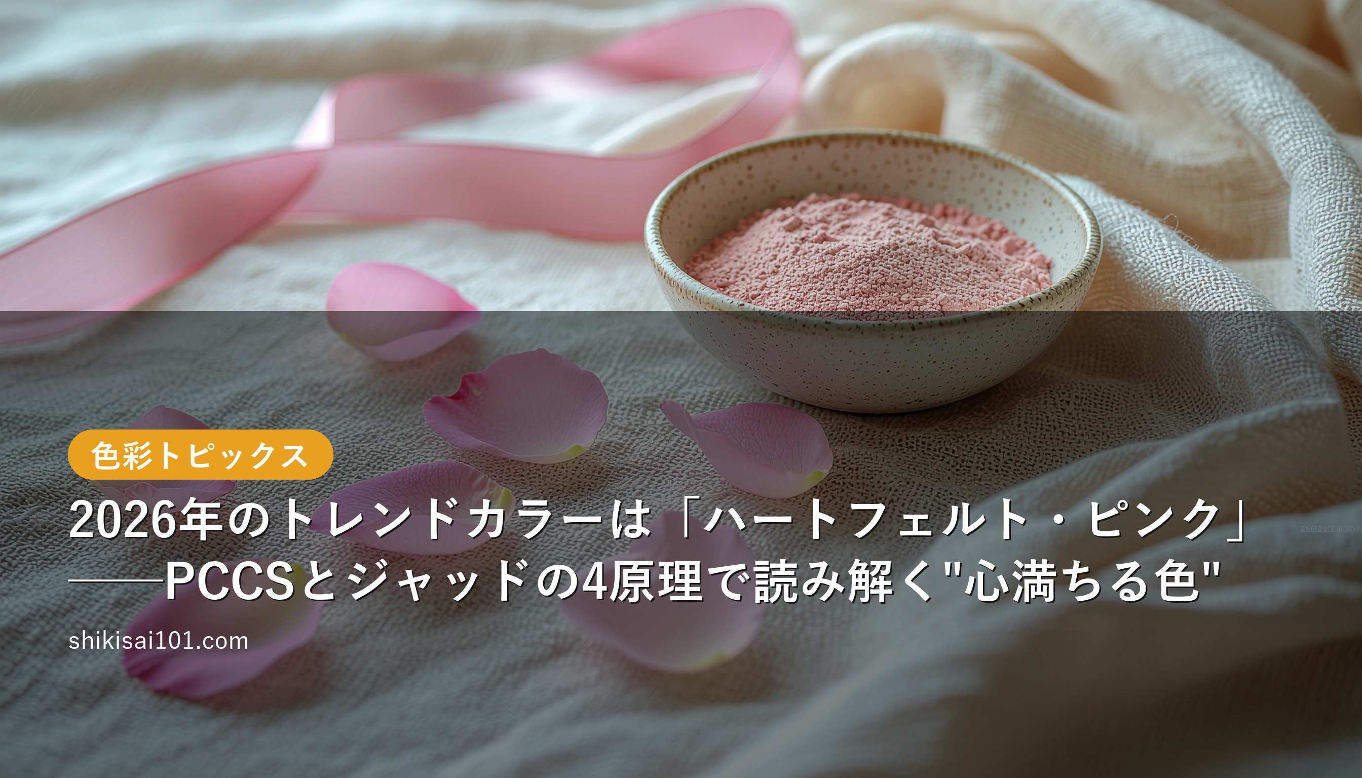
Heartfelt Pink: The 2026 Color of the Year — Decoding the “Color That Fills the Heart” Through PCCS and Judd’s Four Principles
The Buzz: 2026’s Key Color Is a “Pink That Moves the Heart”
Color trend forecasters across the industry are converging on pink as the key color for 2026. Drawing particular attention is the concept of “Heartfelt Pink,” a hue that evokes emotional vitality and physical warmth. After the muted “stillness” of the post-pandemic years, this warm color paired with movement and warmth is being read as a perfect fit for the current cultural mood.
In fashion as well, the Spring/Summer 2026 forecasts place dusty lavender, magenta rose, and nuanced rose — pinks and red-purples — at the top of the ten leading trend colors, making it fair to call this “the year of pink.”
Color Analysis: Reading “Heartfelt Pink” Through PCCS
Let’s analyze this color through the PCCS (Practical Color Co-ordinate System), the framework widely used in Japanese color education. PCCS is distinctive for organizing color along two axes: Hue and Tone.
A “heart-filling” pink like Heartfelt Pink isn’t simply a pale pink — it retains a slight saturation, placing it in the range of lt (light) to sf (soft) tones.
- Hue: Red to red-purple (PCCS 2:R to 24:RP)
- Tone: lt (light, slightly tinted) to sf (medium lightness, medium chroma)
- Image words: soft, friendly, warm, generous
Representative examples include Toki-iro ■ #ECA5B2 (a light-pink-leaning Japanese traditional color named after the crested ibis) and Nadeshiko-iro ■ #E18F9B (a magenta-rose-leaning color named after the Japanese pink flower). The key point is that this is not a vivid (v-tone) electric pink but rather a “breathable pink” softened by white or gray.
What to Pair With Heartfelt Pink: Judd’s Four Principles of Color Harmony
The renowned color theorist D.B. Judd distilled the conditions under which a color combination feels beautiful into four principles of harmony. Let’s use these principles to think about what pairs well with Heartfelt Pink.
For all examples below, Heartfelt Pink is represented by Toki-iro ■ #ECA5B2. Each combination is shown as a two-color pair: Heartfelt Pink + companion color.
1. The Principle of Order — Choose colors at regular positions in color space
In Munsell or PCCS color space, colors at regular intervals or relationships create an orderly beauty.
Create contrast with near-complementary colors: Placing greens — diagonally opposite on the hue circle — as accents creates an orderly contrast palette.
- Toki-iro (■ #ECA5B2) × grayish green close to Oitake-iro ■ #858D70 (■ #8FA68A): A muted green quietly anchors the gentle pink — a subdued, Japanese-style contrast.
- Toki-iro (■ #ECA5B2) × light green leaning toward fresh-bud green (■ #A8B89A): A natural, airy complementary contrast that evokes spring’s new growth.
2. The Principle of Familiarity — Use combinations seen in nature
Color combinations that exist in the natural world feel inherently approachable and unjarring to the human eye.
Cherry blossoms and sky:
- Toki-iro (■ #ECA5B2) × pale blue close to Mizu-iro ■ #ABDBE3 (■ #CFE3EC): Cherry blossoms in full bloom against a serene spring sky — an iconic Japanese landscape.
Sunset sky:
- Toki-iro (■ #ECA5B2) × warm beige between ivory and unbleached cream (■ #E8DCC4): The gentle quiet of dusk, where pink slowly dissolves into warm light.
- Toki-iro (■ #ECA5B2) × apricot leaning toward usu-kō (pale incense) (■ #F8D8B7): The lingering warmth of the afterglow staining the horizon just before sunset.
Cheeks and skin:
- Toki-iro (■ #ECA5B2) × skin tone close to Komugi-iro ■ #D68F5E (■ #D7B190): Flushed cheeks against sun-kissed skin — a combination that evokes vitality.
Because these are “scenes we’ve seen before,” even beginners can confidently use them.
3. The Principle of Similarity — Unite colors through a shared attribute
When colors share a common hue, lightness, or chroma, the result is a calm, cohesive palette.
Unify by hue: An analogous palette where every color shares red-purple as its common thread.
- Toki-iro (■ #ECA5B2) × deep magenta rose close to Botan-iro ■ #D95D97 (■ #D95D97): Light-and-dark variation within the same red-purple family creates depth and elegance.
- Toki-iro (■ #ECA5B2) × coral pink close to Nadeshiko-iro ■ #E18F9B (■ #EA9395): A pink-on-pink gradient — gentle and delicate.
Unify by tone: Combining pale lt-to-sf tone colors yields a soft, tonally consistent impression.
- Toki-iro (■ #ECA5B2) × pale mint green close to Byakuroku ■ #CAE3BF (■ #B8DDD0): A pastel-on-pastel harmony — refreshing and spring-like.
- Toki-iro (■ #ECA5B2) × cream yellow leaning toward tori-no-ko (eggshell) (■ #F4E5B0): A bright, charming pairing reminiscent of a flower field.
- Toki-iro (■ #ECA5B2) × pale sky blue leaning toward shira-ai (pale indigo) (■ #BFD8E8): A clear, refreshing contrast unified by tone.
4. The Principle of Unambiguity — Make relationships clear and avoid the in-between
The clearer the relationship between colors, the more refined the result. Avoid half-measures.
Make lightness contrast crisp: Separate light from dark decisively.
- Toki-iro (■ #ECA5B2) × dark brown close to Kogecha ■ #5C4138 (■ #5C4138): Deep brown grounds the airy, light pink with quiet strength.
Make chroma contrast crisp: Place a vivid color as a small accent within the muted pink.
- Toki-iro (■ #ECA5B2) × vivid crimson close to Karakurenai ■ #DF5464 and Beni-iro ■ #C41A41 (■ #DE5065): Both reds, but the chroma gap draws the eye sharply.
- Toki-iro (■ #ECA5B2) × golden yellow close to Yamabuki-iro ■ #EFA92A (■ #D9A441): Gold sparkles as an accent within the pale pink.
What to avoid: muddled pairings with greige or beige at similar lightness and chroma. The boundaries blur, and the palette ends up looking indecisive.
In other words, 2026’s pink is a color that can be guided into a “winning combination” depending entirely on which colors you pair it with.
Takeaways for Readers: Single-Point Application and “Tonal Unity”
To incorporate this trend into daily life, keep these tips in mind:
- Use vivid (v-tone) pinks only in small areas; for larger surfaces, choose lt to sf tones.
- Leverage the principle of similarity within the red-purple hue family by linking rose-toned accessories together.
- Anchor the look with bases that provide clear lightness contrast — Kon-iro ■ #1D3156 (navy), dark gray, or off-white.
Rather than thinking “pink because it’s 2026,” look at the PCCS tone chart and ask yourself: “Which lightness and chroma of pink truly moves my heart?” Trends are only an entry point. Color is a mirror that reflects your own heart.
References & Sources
- 2026’s Color: “Heartfelt Pink” That Fills the Heart - Color Trends
- Spring/Summer 2026 Trend Colors: Pinks and Blues for Mature Women
- Spring/Summer 2026 Trend Colors: Top 10 Trending Hues from the Runways
- Shikisai101® Color Name List (202 Colors)
- Japan Color Research Institute, PCCS (Practical Color Co-ordinate System) Guide
- D.B. Judd & G. Wyszecki, Color in Business, Science and Industry (Judd’s Four Principles of Color Harmony)