PCCS stands for Practical Color Co-ordinate System
and is a color system developed by the Japan Color Research Institute
. It is also known as the Japan Color Research Institute Color System.
PCCS is a color system designed to be easy for beginners to understand when learning the three attributes of color (hue, value, and saturation)
. It is structured to allow colors to be categorized by hue and tone (groups of value and saturation)
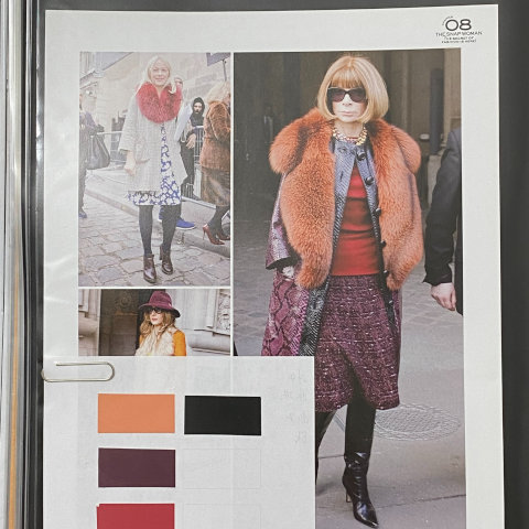
, making it easier to grasp everyday colors.When planning fashion or home decor, being able to visualize the PCCS color chart makes color selection much smoother.
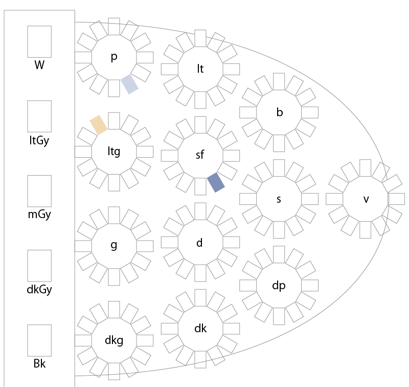
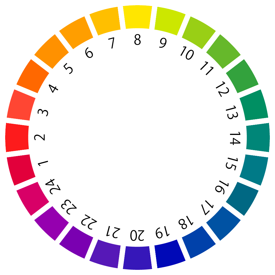
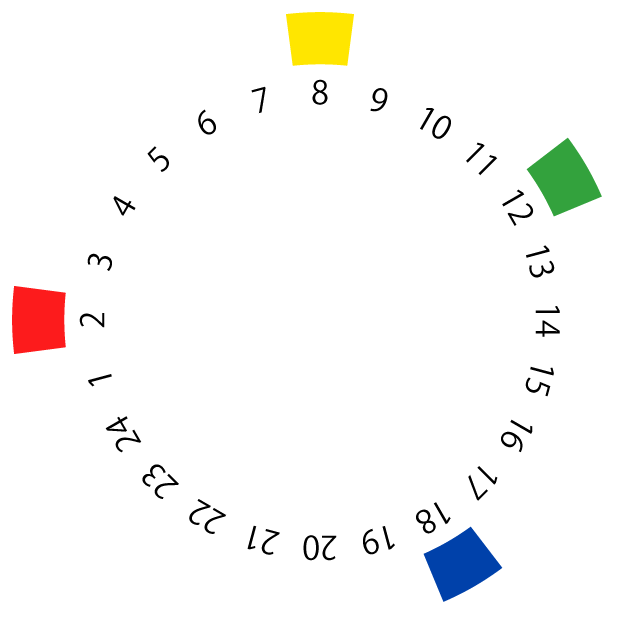
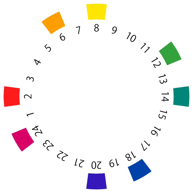
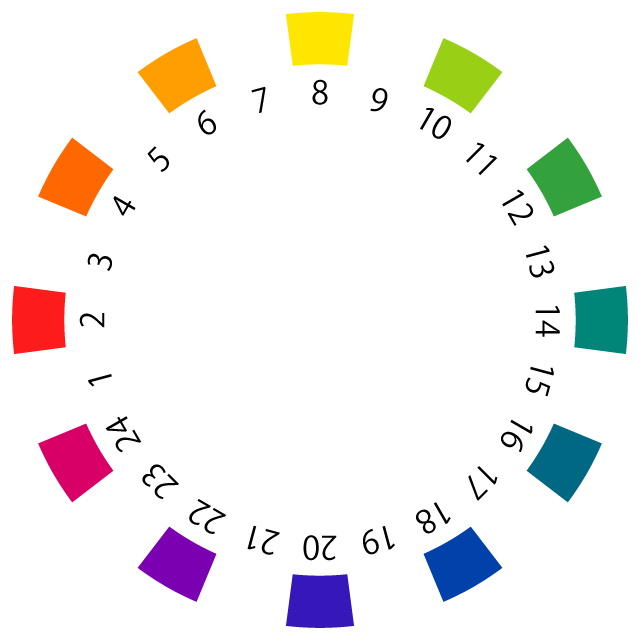
PCCS is displayed using 24 hue categories, 17 value categories, and 10 saturation categories; however, it can also be displayed in 12 categories by grouping value and saturation into “tones.” Using the hues within each tone makes it easier to grasp color schemes for fashion, interior design, and other applications.
Color swatch cards (color charts)
for each hue and tone are available from Nihon Iro Kenkyujo Co., Ltd. and can be purchased for about 900 yen each. Since this system is the most familiar in Japan and easy for beginners to use, I highly recommend using it when you start learning color coordination.
Let’s take a look at the PCCS hue classifications and the classifications of lightness and saturation.
The PCCS color system consists of 24 hues.PCCS has 12 tones grouped by value and saturation.
PCCS Hues >>
In PCCS, hue is referred to as “Hue,” and the color wheel
used to represent hue differences employs vivid, unsaturated colors (pure colors
). These colors are defined as follows:
First, the four psychological primary colors (colors where only the specific hue is perceived—e.g., red, yellow, green, and blue) are determined.
When you stare intently at a color and then remove it from your vision, the afterimage color you see (blue-green in the case of red) is called the psychological complementary color. Adding these four psychological complementary colors to the four psychological primary colors results in eight colors.
Red → Blue-green
Yellow → Blue-violet
Green → Red-violet
Blue → Yellowish orange
Next, arrange these 8 colors in a circle so that the psychological complementary colors are positioned directly opposite each other. This creates large gaps between them, so by adding 4 intermediate colors to ensure the hue transitions feel smooth, the total becomes 12 colors.
By defining the colors between each of these 12 hues and combining them, we arrive at the 24 colors that make up the PCCS color system.
Each hue is assigned a hue number and a hue name.
PCCS Lightness >>
In PCCS, value is referred
to as "Lightness."
Value refers to the brightness of a color and is based on an achromatic grayscale ranging from white to black.
The lightest white is assigned a lightness value of 9.5, the darkest black is assigned a value of 1.5, and the values in between are set in 0.5 increments, resulting in a total of 17 levels.
Values from 1.5 to 4.0 are low lightness, 4.5 to 6.5 are medium lightness, and 7.0 to 9.5 are high lightness.
PCCS Saturation >>
In PCCS, saturation is referred to as "Saturation."
Saturation refers to the vividness of a color. In PCCS, it is represented on a
10-point scale, with achromatic colors set to 0 and the most vivid colors set to 9.
When denoting saturation, an "s" (for "Saturation") is appended to the number.
0s is achromatic, 1s–3s is low saturation, 4s–6s is medium saturation, and 7s–9s is high saturation.
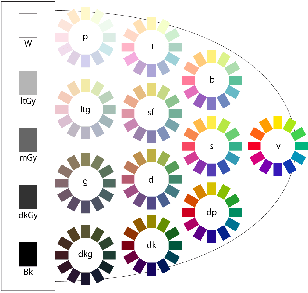
Tone
We often use the word “tone” in everyday conversation, don’t we? We describe colors based on the impression or feeling they convey, such as “light tones,” “bright tones,” or “vivid tones.”
In PCCS
,
areas of lightness and saturation that share similar impressions or images are called “tones
,
”
and they are classified into a total of 12 tones.
Each tone has its own distinct image.
When you want to create a certain image, using tone as a guide makes it easier to choose colors.
Since tones are simply groups of colors that convey similar impressions or images, their numerical values for lightness and saturation do not necessarily match.
While saturation values tend to be relatively close, there is variation in lightness. For example, in the light tone (lt) category, hue number 8 (yellow) is a high-lightness color, whereas hue number 20 (blue-violet) is a medium-lightness color.
Even with such variations in value and saturation, color combinations that share the same overall impression create a sense of unity and form the basis of color schemes.
The "tone-on-tone" color scheme technique involves combining two or more colors within the same tone—essentially "matching tones"—and is very useful for expressing a specific image.
Please be sure to remember the characteristics of each tone!
Online Practice Questions
The practice workbooks for the Color Certification® exam available on this site also include questions related to PCCS.
There are color coordination techniques and methods for creating visual imagery using PCCS. These are summarized on separate pages, so please take a look.
By selecting colors used in an outfit using PCCS’s analogous colors, you can practice color coordination.
On this site, under the “Enjoying Color” category, we introduce color coordination for women’s fashion, men’s fashion, and interior design and home goods.
PCCS is the most widely used color system in Japan. Understanding PCCS will enable you to create appropriate color schemes not only for color coordination but also for product design, packaging design, flyer design, and web design.

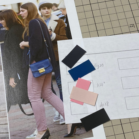
 You can also check which colors are used in online images.