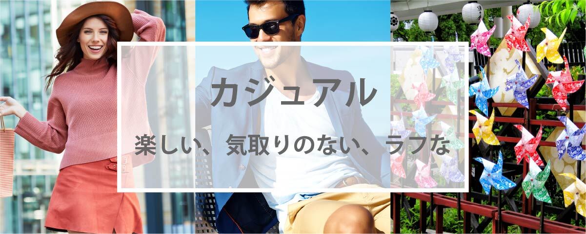
Image of casual color scheme - fun, unpretentious, rough
Published Updated
Overview of the Casual Aesthetic
Casual is a color scheme centered on warm tones, particularly orange, which evokes the feeling of sunlight, and features high-brightness, high-saturation colors.
Like the commonly used term "casual," this style conveys an image that blends naturally into everyday life without pretension, exuding a sense of freedom. Combining warm colors with intermediate tones such as yellow or green creates a warm, cozy casual look, while pairing them with cooler tones like blue or purple results in a cool, refreshing casual style.
In fashion, this style is casual and active, such as pairing a T-shirt with cotton pants or a cardigan. Add a more active touch than the "Natural" style. Materials and patterns include a wide range of fabrics such as cotton, polyester, and knit, with gingham checks, small polka dots, floral patterns, and stripes being commonly used.
Like the commonly used term "casual," this style conveys an image that blends naturally into everyday life without pretension, exuding a sense of freedom. Combining warm colors with intermediate tones such as yellow or green creates a warm, cozy casual look, while pairing them with cooler tones like blue or purple results in a cool, refreshing casual style.
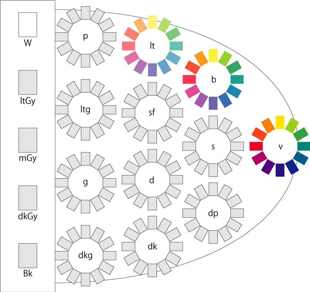
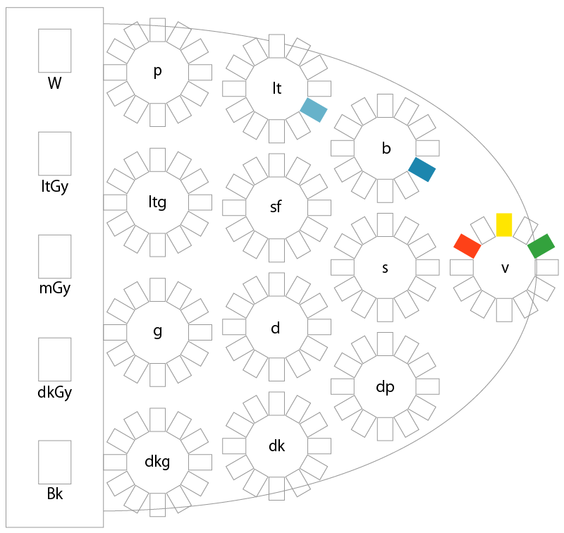
<Hues and Tones Used>
In fashion, this style is casual and active, such as pairing a T-shirt with cotton pants or a cardigan. Add a more active touch than the "Natural" style. Materials and patterns include a wide range of fabrics such as cotton, polyester, and knit, with gingham checks, small polka dots, floral patterns, and stripes being commonly used.
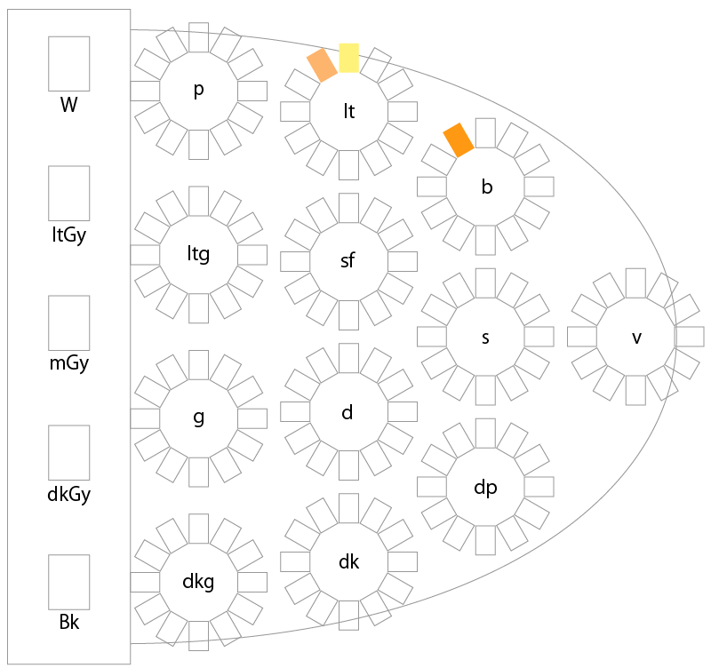
Casual Color Scheme Example 1
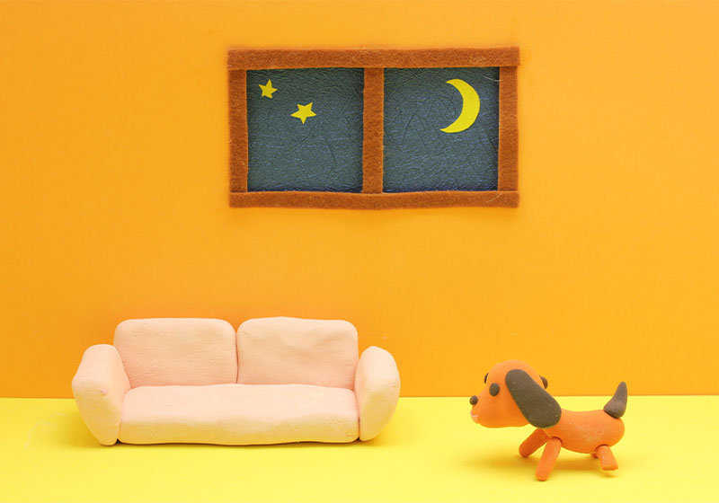
<Color Swatch Samples>

<PCCS Tone Chart (Approximate Colors)>
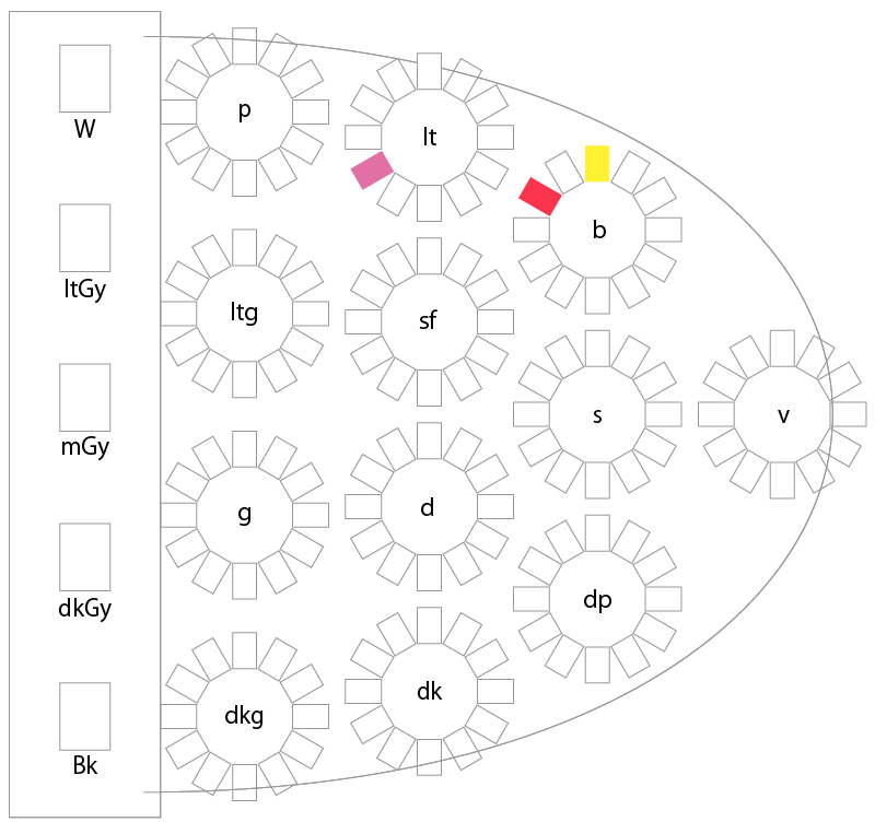
Casual Color Scheme Example 2
<Color Swatch Sample>
<PCCS Tone Chart (Similar Colors)>
Casual Color Scheme Example 3
<Color Swatch Samples>
<PCCS Tone Chart (Similar Colors)>
Color Combination Techniques and Creating a Visual Image
Understanding color harmony makes it easier to incorporate casual color schemes into your designs and outfits. Please also check the differences between representative colors and those with a casual vibe.
<Color Scheme Techniques>
Tone-on-Tone Color Scheme, Tone-in-Tone Color Scheme, Tonal Color Scheme, Camayeu Color Scheme, Focamayeu Color Scheme
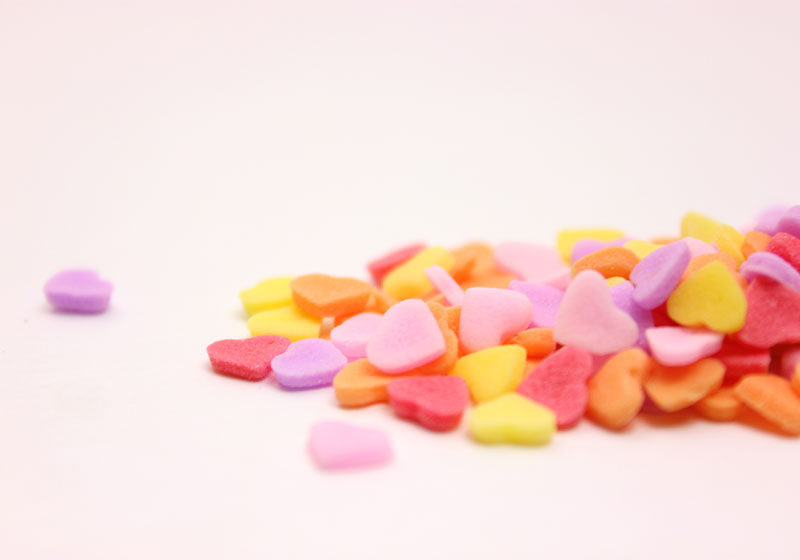
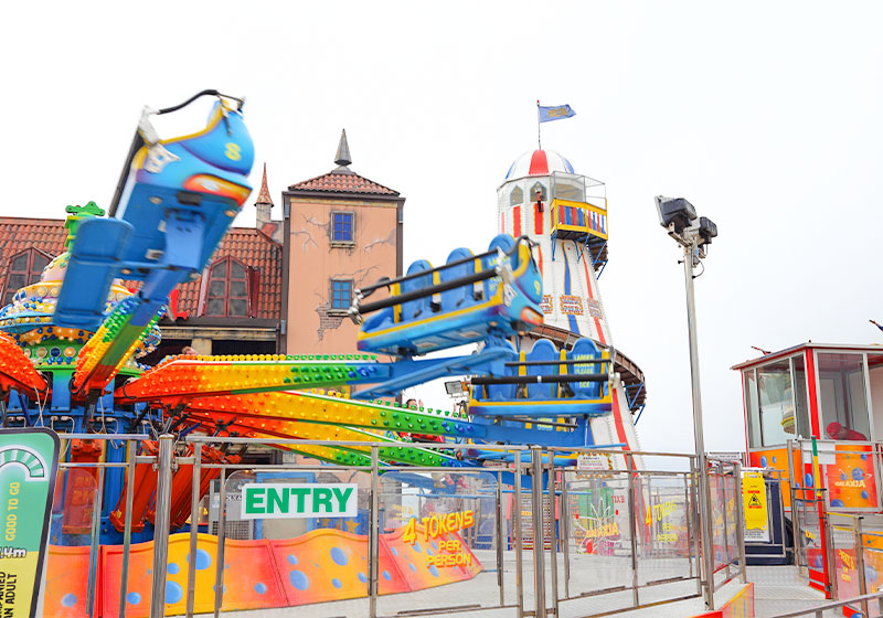
<Casual-Style Images>
Casual-Related Information
Click here to view information related to the "Casual" image♪