
Home Color Scheme Quiz: The "Right Colors" for Every Room, from Entryway to Bedroom (5 Questions)
Published
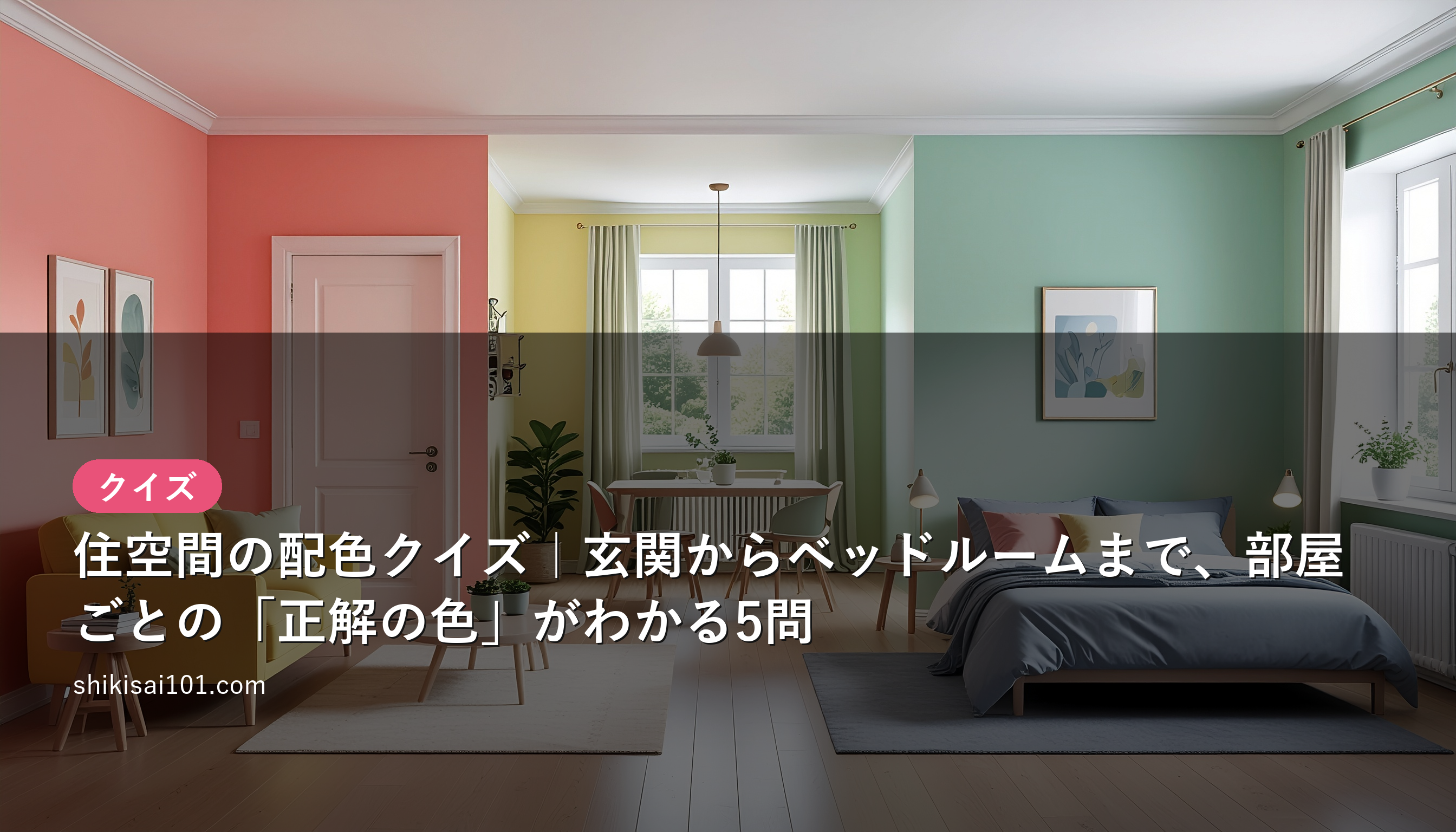
One thing that's surprisingly easy to overlook when choosing colors for your home is the idea that the right color changes depending on each room's role. Paint your living room and bedroom with the same mindset, and you may end up with a space that just doesn't feel quite settled.
Interior color schemes become far easier to organize once you divide your living space into three groups.
- Public spaces (entryway, living room) — the "on display" areas where you welcome guests and the family gathers
- Semi-public spaces (dining room, kitchen, bathroom, toilet) — the "working" areas that serve a function
- Private spaces (bedroom, children's room) — the "unwinding" areas where you rest your mind and body
Keep this framework in mind and take on all five questions. Try to read each one through the lens of hue, brightness, and saturation.
Q1. When planning the color scheme for your living space, which "approach" is said to make mistakes least likely if you do it first?
- A. Mechanically assign color tones based on each room's floor area and ceiling height
- B. Divide rooms into three groups by their role (degree of publicness), then decide the color direction for each group
- C. Fix the hue for each room based solely on the direction its windows face and how much daylight it gets
- D. Unify the whole house in a single tone and deliberately avoid any color differences between rooms
Show answer
Correct answer: B (Divide rooms into three groups by their role (degree of publicness), then decide the color direction for each group)
The basic approach is to first divide your living space by its degree of publicness—public, semi-public, and private—and then think about color. Public spaces call for bright, high-brightness tones, while private spaces call for calm, low-saturation tones; in other words, the brightness and saturation goals shift from group to group. Floor area, orientation, and daylight are all useful inputs for choosing colors, but making them your starting axis tends to throw off your overall direction.
Q2. The "entryway and living room," where guests also pass through, belong to which of the three groups? And what color direction should you aim for in that space?
- A. Private space / surround it with deep warm colors, prioritizing a cozy, enclosed sense of security
- B. Semi-public space / push saturation as close to zero as possible to erase any sense of daily life
- C. Public space / use a high-brightness base to create a bright, welcoming impression
- D. Public space / go for a multicolor, high-saturation look, pursuing nothing but flashiness
Show answer
Correct answer: C (Public space / use a high-brightness base to create a bright, welcoming impression)
The entryway and living room are public spaces that even non-family members see. Since they set your home's first impression, pulling them together with a high-brightness base color (such as ivory #F5F0E6 or a pale beige #E8DFCF) makes the space bright and open, creating a "welcome" feeling. An overly saturated multicolor look feels unsettled, while pushing saturation all the way to zero looks cold and clinical.
The entryway may be small in area, but it's a key spot that shapes the impression of your home. Base it on a bright beige or pale tone, and light reflects to make it look wider and brighter than it actually is.
Q3. Why are the dining room, kitchen, bathroom, and toilet all grouped together as "semi-public spaces"?
- A. Because they are all placed facing north, and there's a rule to pull them together in cool colors
- B. Because they are "functional" spaces used by both family and guests, calling for colors that convey cleanliness or stimulate appetite
- C. Because they are hard to light naturally, so only achromatic colors can be used
- D. Because they are used only briefly, so no color affects the impression
Show answer
Correct answer: B (Because they are "functional" spaces used by both family and guests, calling for colors that convey cleanliness or stimulate appetite)
These are in-between spaces: not fully private, yet not as "on display" as the living room. Because their purpose is clear-cut, you choose colors that support that function. For example, the kitchen and dining room pair well with warm colors that stimulate appetite (in the orange #E8A05C family), while the bathroom and toilet suit blue-green cool colors (in the #9FC6C0 family) that convey cleanliness and refreshment. Orientation and daylight are inputs for deciding colors, but they aren't the reason for the grouping itself.
Q4. The "bedroom" soothes away the day's fatigue. As a color scheme for a private space, which is least likely to go wrong as a first choice?
- A. A high-brightness, high-saturation warm tone that keeps you energetic until morning
- B. A calm tone with a hint of blue, low in saturation and mid-to-low in brightness
- C. A tone using several high-purity primary colors to maximize contrast
- D. A single pitch-black tone, the darkest of the achromatics, that shuts out light entirely
Show answer
Correct answer: B (A calm tone with a hint of blue, low in saturation and mid-to-low in brightness)
The bedroom is a private space where you rest mind and body. Blues activate the parasympathetic nervous system to calm your feelings, and keeping saturation low heightens the relaxing effect. High-saturation warm colors and primary-color contrast stimulate the sympathetic nervous system and tend to keep you wide awake—unsuited to a place of rest. That said, an all-black scheme feels oppressive, so the right choice is a "bluish color you can sleep quietly in."
Q5. A "children's room" is also a private space, but why is it a bit of a missed opportunity to paint it with the same thinking as a bedroom alone?
- A. Because there's a rule that no high-saturation colors may ever be used in a children's room
- B. Because it's a place for play and learning, not just sleep, so brightness and saturation need to vary by zone
- C. Because children have weaker color discrimination than adults, so color effects don't work on them
- D. Because children have been shown to prefer darker, lower-saturation colors than adults
Show answer
Correct answer: B (Because it's a place for play and learning, not just sleep, so brightness and saturation need to vary by zone)
Even within the same private space, a children's room plays a dual role: "rest" plus "growth." Give the sleeping area calm, low-saturation colors just like a bedroom, and give the play and study corners high-brightness, high-saturation warm colors or yellows (such as the yellow #F2C94C family—colors that lift the mood and encourage activity); painting it by zone lets you have both. Looking all the way down to the "finer roles within the role" and using brightness and saturation accordingly is your first step toward the advanced level.
Home color schemes start from "dividing rooms into three groups by their role." Public spaces welcome you brightly with high brightness, semi-public spaces support their function with colors that aid appetite or cleanliness, and private spaces rest mind and body with low saturation—with this map in hand, you'll never get lost choosing colors.