Empowering Society Through Color
Making color, coordination, and design more accessible.
202 color names, 235 color schemes. From color certification prep to everyday color coordination.

Latest Articles
-
 Color Topics
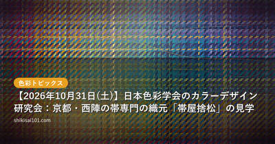
Kyoto Nishijin Obi Weaving Studio Tour: Color Design Study Group, Japan Color Science Association (Saturday, October 31, 2026)
The Color Design Study Group of the Color Science Association of Japan is accepting applications for a tour of Obiya Sutematsu, an obi-weaving house in Nishijin, Kyoto. Saturday, October 31, 2026, 10:30–12:30. Applications close October 22.
-
 Color Topics
VSAT 13th Open Event (Oct 22, Yokohama Kannai): Four Talks on AR Imaging, Visualization, and AI
The Vision Science and Technology Consortium (VSAT) holds its 13th open event on October 22, 2026 in Kannai, Yokohama. Here are the four talks — AR beauty experiences, awe research, industrial VR visualization, and the state of AI — plus fees and registration.
-
 Color Certification
色彩検定を受ける人の学習方法・目的・つまずく分野 ― 1,179人に聞きました(2026年)
色彩検定に関心のある1,179人に、勉強のしかた・目的・使っている教材・むずかしいと感じた分野を聞きました。独学の割合、年代で変わる目的、3級と2級で違うつまずきどころを、図で紹介します。
-
 Quizzes
Color and Culture Quiz: 5 Questions on Kabuki Curtains, Japan's "Blue" Traffic Lights, Dutch Orange, the Hinomaru, and Tyrian Purple
Five questions tracing how colors got their names and roles: the three stripes of the kabuki stage curtain, the "blue light" written into Japanese traffic law, the Dutch House of Orange, the "crimson" of the national flag law, and the source of Tyrian purple.
-
 Color Topics
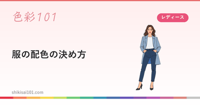
服の配色の決め方 ― 面積・色相・トーンで組み立てるコーディネート
服の色合わせは面積・色相・トーンの3つで決まります。コーデの絵15点の面積比を実測値で示し、よく使う5つの組み方、スーツとジャケパンの考え方、季節ごとの実例まで。配色シミュレーターで試せます。
-
 Lifestyle
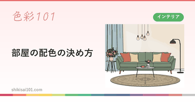
部屋の配色の決め方 ― 面積・色相・トーンで考えるインテリアの色
部屋の色は面積の大きい面から決めます。リビング・ダイニング・寝室など6つの空間の面積比を実測値で示し、面積・色相・トーンの3つで配色を組み立てる手順を解説。配色シミュレーターでその場で試せます。
Lifestyle Features
View more →
-
ブルベ冬(ウィンター)タイプの似合う色 ― 「鮮やかな青みと対比」の活かし方
ブルベ冬(ウィンター)タイプの似合う色を、青み寄りの色相×鮮やかで対比の強いトーンという位置から解説します。白と黒の位置づけ、対比のつくり方、冬寄りへの色の選び直し方、配色例まで。
-
イエベ秋(オータム)タイプの似合う色 ― 「深く落ち着いた黄み」の見つけ方
イエベ秋(オータム)タイプの似合う色を、黄み寄りの色相×深く落ち着いたトーンという位置から解説します。暗さと濁りの見分け方、秋寄りへの色の選び直し方、配色例まで。
-
ブルベ夏(サマー)タイプの似合う色 ― 「明るくやわらかな青み」の見つけ方
ブルベ夏(サマー)タイプの似合う色を、青み寄りの色相×明るくやわらかなトーンという位置から解説します。夏と冬を分ける鮮やかさの軸、夏寄りへの色の選び直し方、配色例まで。
-
イエベ春(スプリング)タイプの似合う色 ― 「明るく澄んだ黄み」の見つけ方
イエベ春(スプリング)タイプの似合う色を、黄み寄りの色相×明るく澄んだトーンという位置から解説します。春寄りへの色の選び直し方、黒や紺の調整方法、配色例まで。
-
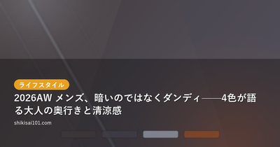
2026 AW Menswear: Not Dark, but Dandy — How Four Colors Speak of Grown-Up Depth and Cool Freshness
A 2026 AW men's outfit picked from Pinterest. Dark grays and blue-violet deep tones paired with a pale sky-blue shirt create quiet, grown-up depth and a cool freshness. From four HEX codes and PCCS tones, we break down how to build a dandy dark-color palette.
-

Men's shirt coordinate: bright orange shirt and reddish beige pants.
Natural&casual color image + Enlargement/3D model × ▼ Natural&casual color image Color coordination of bright orange shirt and reddish beige pants. Natural & casual color image. (adsbygoogle = window.adsbygoogle || []).push({}); (adsbygoogle = window.adsbyg
-

2022-23 Autumn/Winter Color Trends for Menswear (from Japan Fashionable Color Association)
Rhythm & Darkness Rhythm & Darkness + Enlargement/3D model × ▼Rhythm & Darkness Rhythm & Darkness Natural and chic image in beige and dark navy. (adsbygoogle = window.adsbygoogle || []).push({}); + enlarge/3D model × ▼Rhythm & Darkness Rhythm & Darkness
-
![Men's Shirt Coordinate] Combination of cool colors and earth colors](/images/og/Mens-shirt-coordination-Combination-of-cool-colors-and-earth-colors.jpg?w=400&h=250&fit=crop)
Men's Shirt Coordinate] Combination of cool colors and earth colors
Quiet and polite (adsbygoogle = window.adsbygoogle || []).push({}); googletag.cmd.push(function() { googletag.display('div-gpt-ad-1686374690944-0 '); }); Writer/Editor Color On Mitsuru Color Coordinator Web design and flyers while working at a bicycle store
-
部屋の配色の決め方 ― 面積・色相・トーンで考えるインテリアの色
部屋の色は面積の大きい面から決めます。リビング・ダイニング・寝室など6つの空間の面積比を実測値で示し、面積・色相・トーンの3つで配色を組み立てる手順を解説。配色シミュレーターでその場で試せます。
-
"Our Renoir": Kumamoto Prefectural Museum of Art 50th Anniversary Special Exhibition — Bringing That Light-Filled Color Home to Your Own Room
A color-and-interior take on "Our Renoir," the special exhibition marking the 50th anniversary of the Kumamoto Prefectural Museum of Art. Learn how to use the warm skin tones and dappled-sunlight oranges in his paintings as accent colors for a truly relaxing room—plus full exhibition details.
-
![Louis Vuitton x Shiyou Hirano] Image of brown-pink-white color scheme](/images/og/Louis-Vuitton-Sho-Hirano-Brown-pink-white-color-scheme.png?w=400&h=250&fit=crop)
Louis Vuitton x Shiyou Hirano] Image of brown-pink-white color scheme
Classic x Modern changing color scheme View this post on Instagram A post shared by Sho Hirano (@sho_h_desyo) (adsbygoogle = window.adsbygoogle || []).push({}); googletag.cmd. push(function() { googletag.display('div-gpt-ad-1686374690944
-
![Contrasting Hue Color Scheme] Yellowish green and navy blue to create a noble and neat atmosphere to match white.](/images/og/contrasthuecolor-yellowgreen-deepblue-white.png?w=400&h=250&fit=crop)
Contrasting Hue Color Scheme] Yellowish green and navy blue to create a noble and neat atmosphere to match white.
Comfortable contrasting hues contrasting tones + white View this post on Instagram Francfranc Francfranc | Interiors & Furniture (@francfranc_official) shared (adsbygoogle = window.adsbygoogle || []). push({}); googletag.cmd.push(function() { googletag.display('d
Look Up Colors
Color Names
View 202 colors →Color Schemes
View 265 patterns →- Color Pattern (#D8D8D6, #AE4054, #A87749, #7599A8) ナチュラル · クラシック
- Color Pattern (#C5E4F7, #81D2F3, #00B8F8, #011769, #090F2A) モダン · クール
- Color Pattern (#BB6558, #B6968A, #C7B772, #94ADA7) ナチュラル
- Color Pattern (#ADBE56, #627D53, #1B3B10) カジュアル · ナチュラル
- Color Pattern (#C8A2E6, #F3E7FF, #6BA0E0, #608FD5) ナチュラル · エレガント
- Color Pattern (#DAD1C6, #CBB395, #DCA088, #A6CAC6) カジュアル · ナチュラル
Color Basics
View more →-
Clothing Color and Perceived Warmth: Why Warm Colors Look Hot but Near-Infrared Absorption Decides Real Temperature
How does clothing color affect perceived warmth? A study in the Journal of Home Economics of Japan found red and yellow fabrics felt warmest in surveys, while darker fabrics reached higher temperatures under lamp irradiation—with near-infrared absorption showing strong correlation.
-
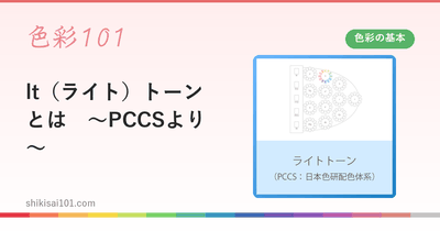
What is lt (light) tone - from PCCS
*The colors in the figure are samples. Light tones in the PCCS (Public Color Control System of Japan) are tones characterized by bright, clear colors. They have a light, fresh impression and are sometimes described as childish. By making good use of their characteristics, they are suitable for expressing positive emotions such as fun, bright, and cute. Light-toned colors are light shades with high brightness and medium saturation. The soft tones have a clear and clear
-
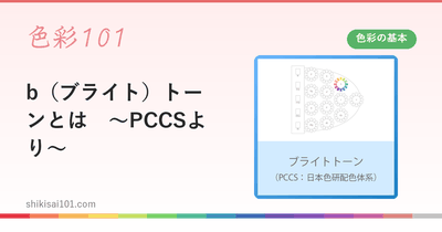
What is b (Bright) Tone - from PCCS
*The colors in the figure are samples. Bright tones are one of the bright tones in the PCCS (Color Scheme of the Color Science Institute of Japan), and refer to bright shades. They are brighter than vivid tones and are generally described as having bright, healthy, cheerful, and flamboyant characteristics. Other descriptors include vibrant, bright, clear, lucid, and bright-light. Saturation: Bright tones are a group of colors with relatively high saturation.