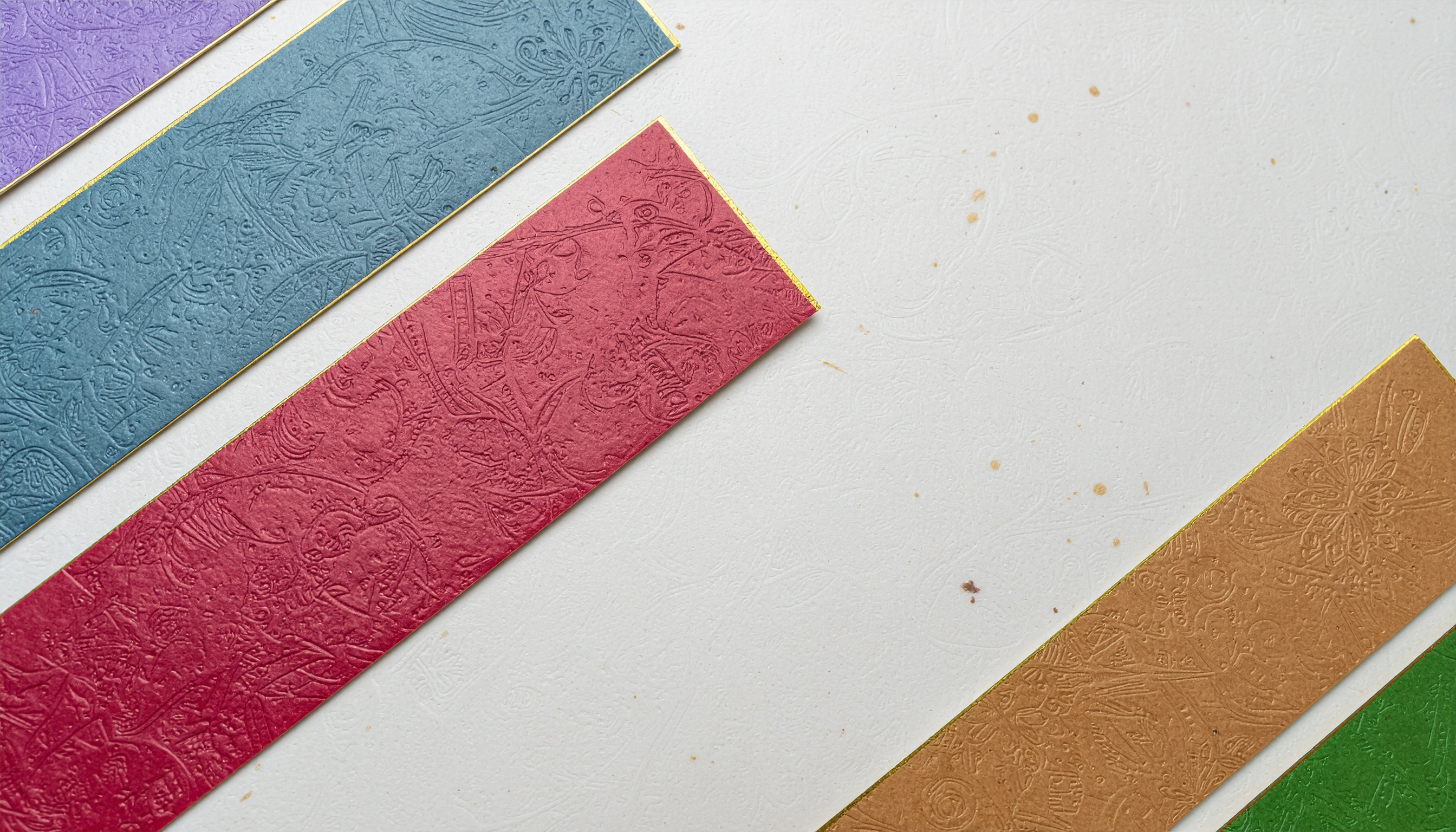
Color scheme pattern (#D8D8D6, #AE4054, #A87749, #7599A8)
Colors in this scheme
| Color | HEX | RGB | Nearest PCCS color |
|---|---|---|---|
216, 216, 214 | N8.5 | ||
174, 64, 84 | s2 | ||
168, 119, 73 | d6 | ||
117, 153, 168 | sf16 |
A pale warm gray (#D8D8D6) acts like negative space, against which a dusty madder red (#AE4054), an ochre kuchiba brown (#A87749), and a subdued slate blue (#7599A8) are arranged. The result carries a distinctly Japanese, understated character.
Because the warm reds and browns are paired with the cool blue at a shared, muted brightness, the contrast never feels harsh; instead a calm, cohesive harmony emerges, with the neutral gray quietly linking the three chromatic tones together.
The palette suits Japanese-style packaging, cards, brochure backgrounds, and texture assets — anywhere a refined, restrained mood is desired. Its low-saturation tones are easy on the eyes and evoke the warmth of traditional colorways.
Pattern Examples
Each press changes how the colors are applied. Tap a round swatch to pick a color one by one.